Kreas
Typeface Design | Letterform
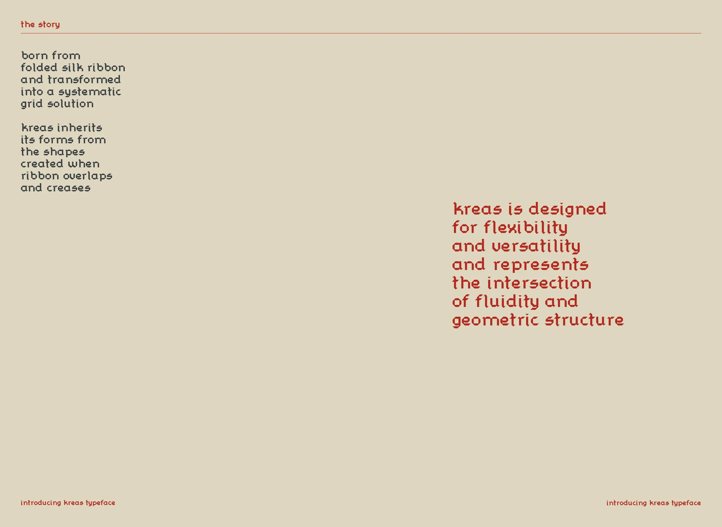
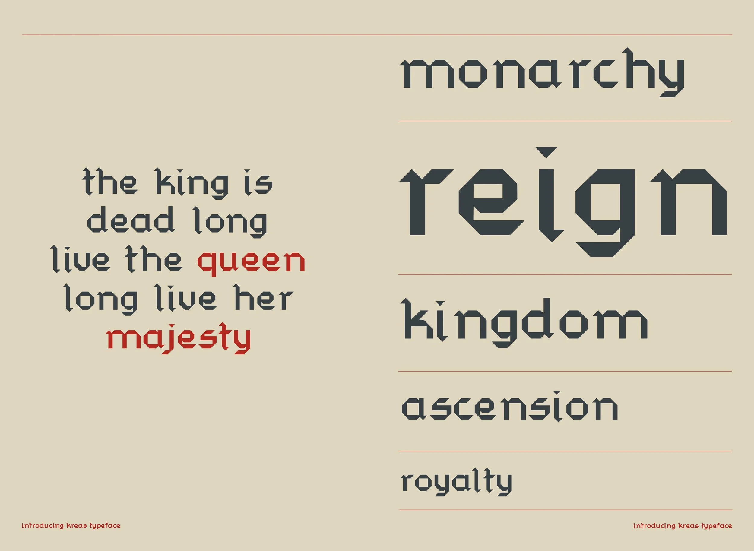
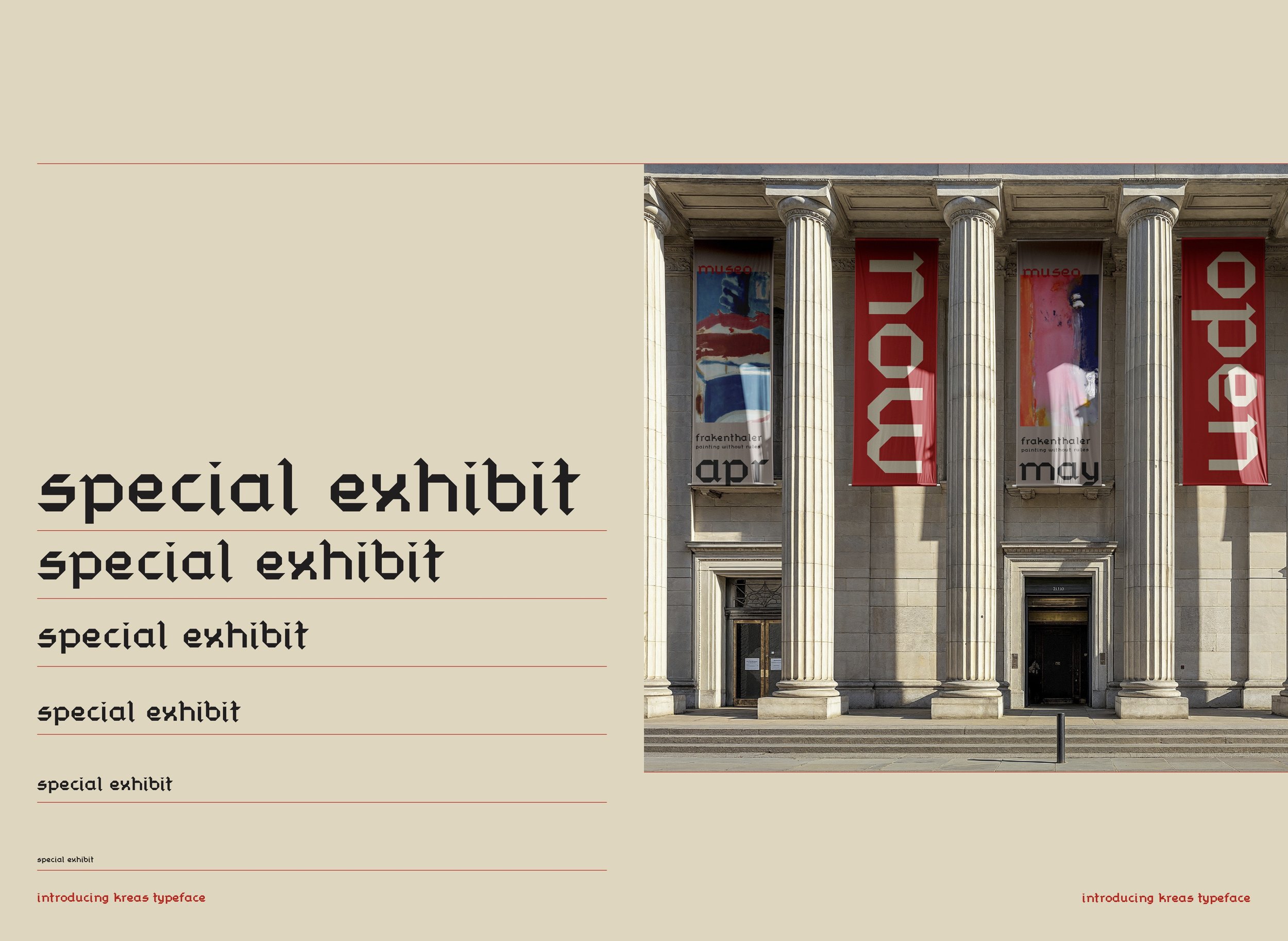
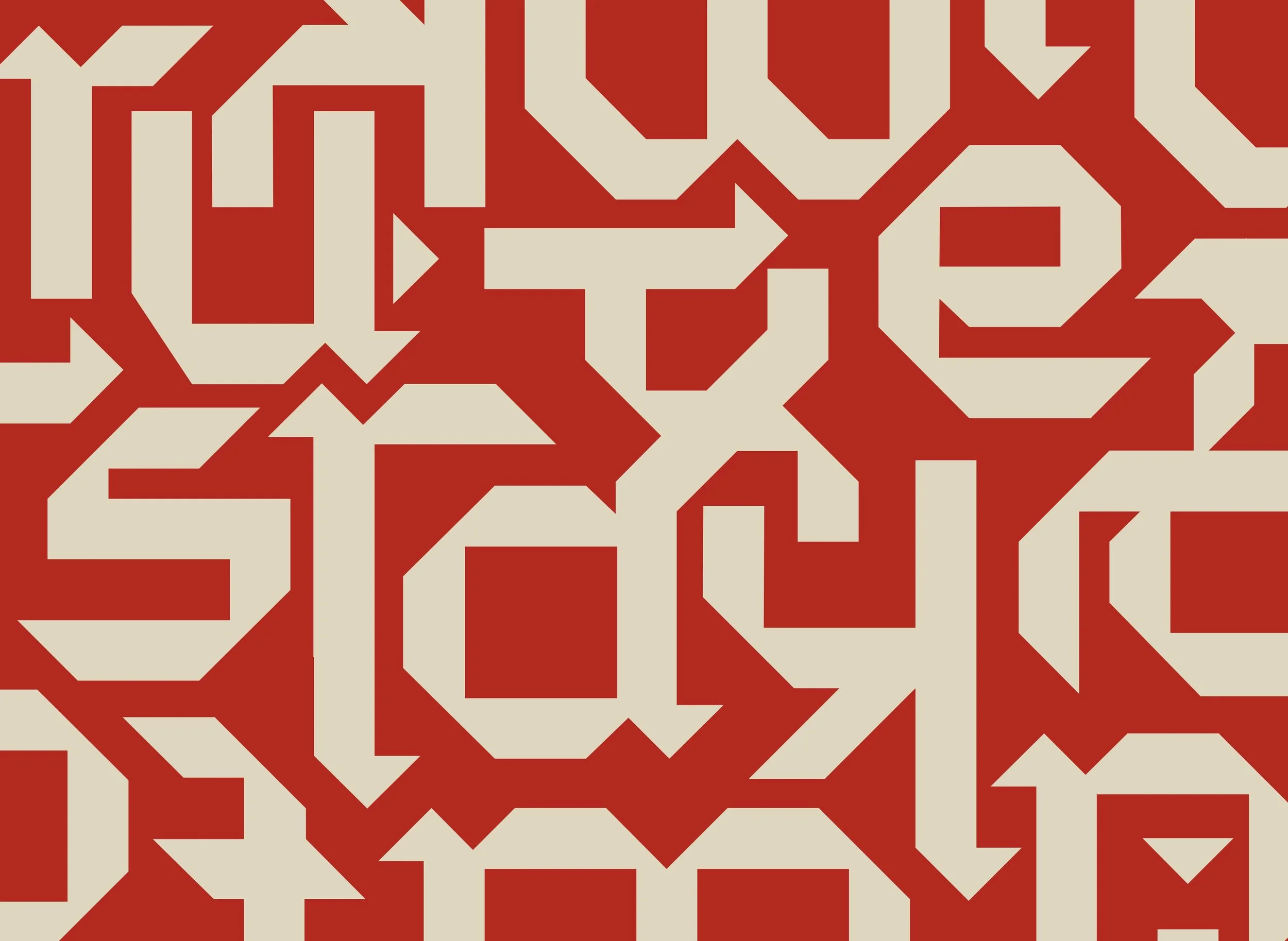
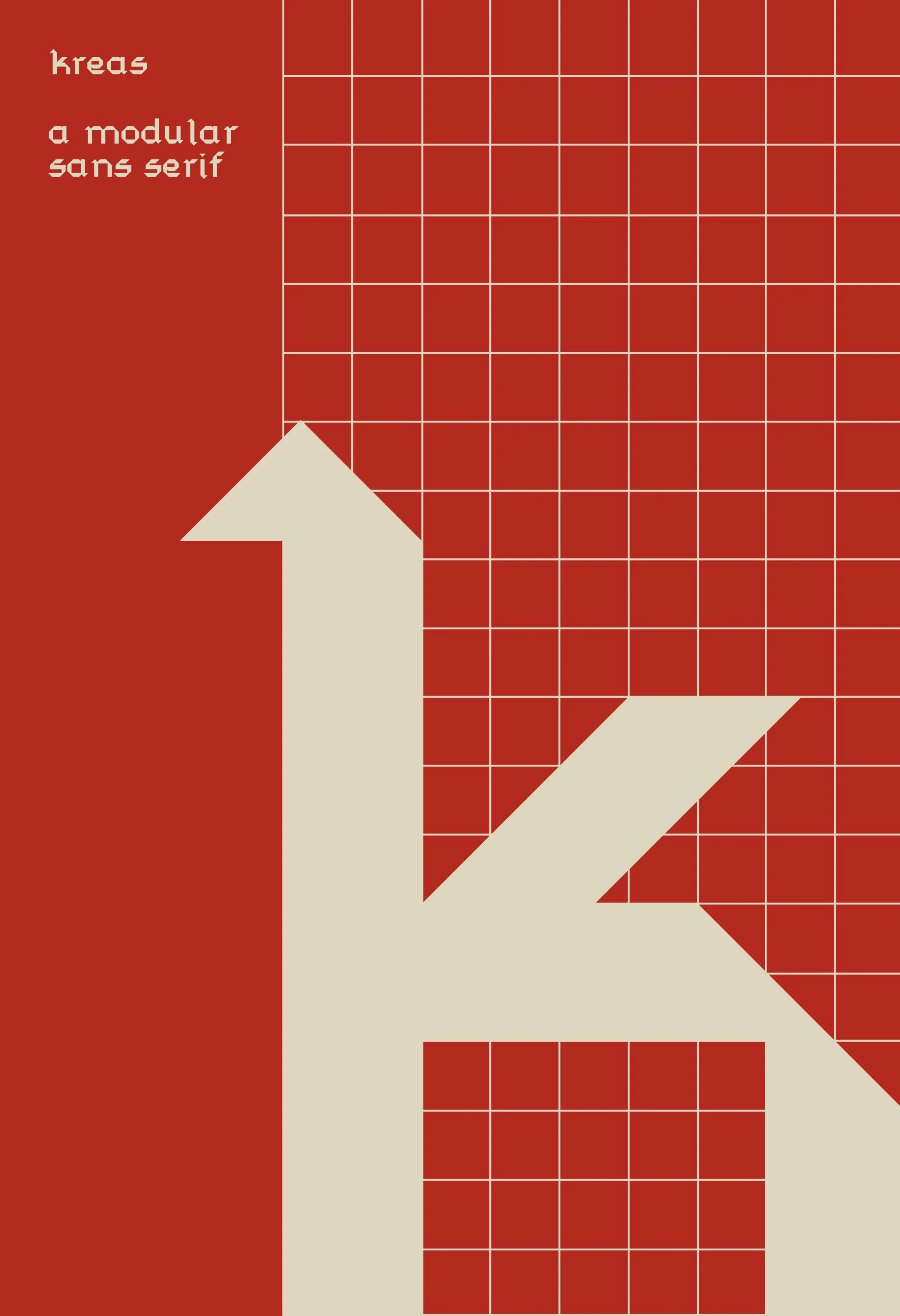
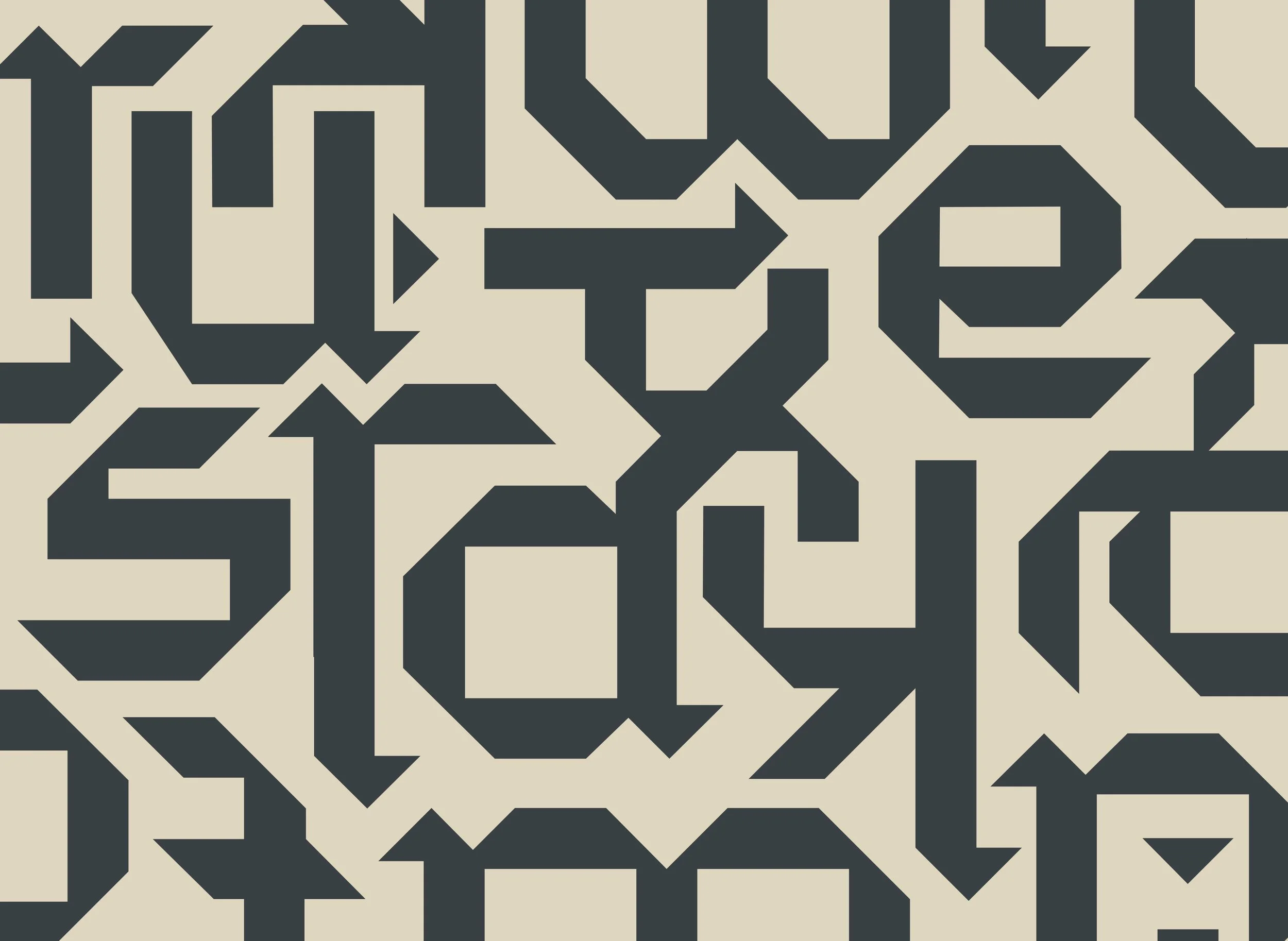
Kreas (ˈkrēs) is a modular sans serif typeface inspired by the sharp creases that form when folding ribbons. When ideating ways to create this typeface, I knew I wanted to begin with a tactile foundation, and luckily, I had extra ribbon on hand. Creating Kreas was a challenge in transforming the traditional associations of ribbon—elegance, fluidity, and femininity—into something bold, sharp, and brutalist, all while preserving subtle hints of its folded origins.
Process
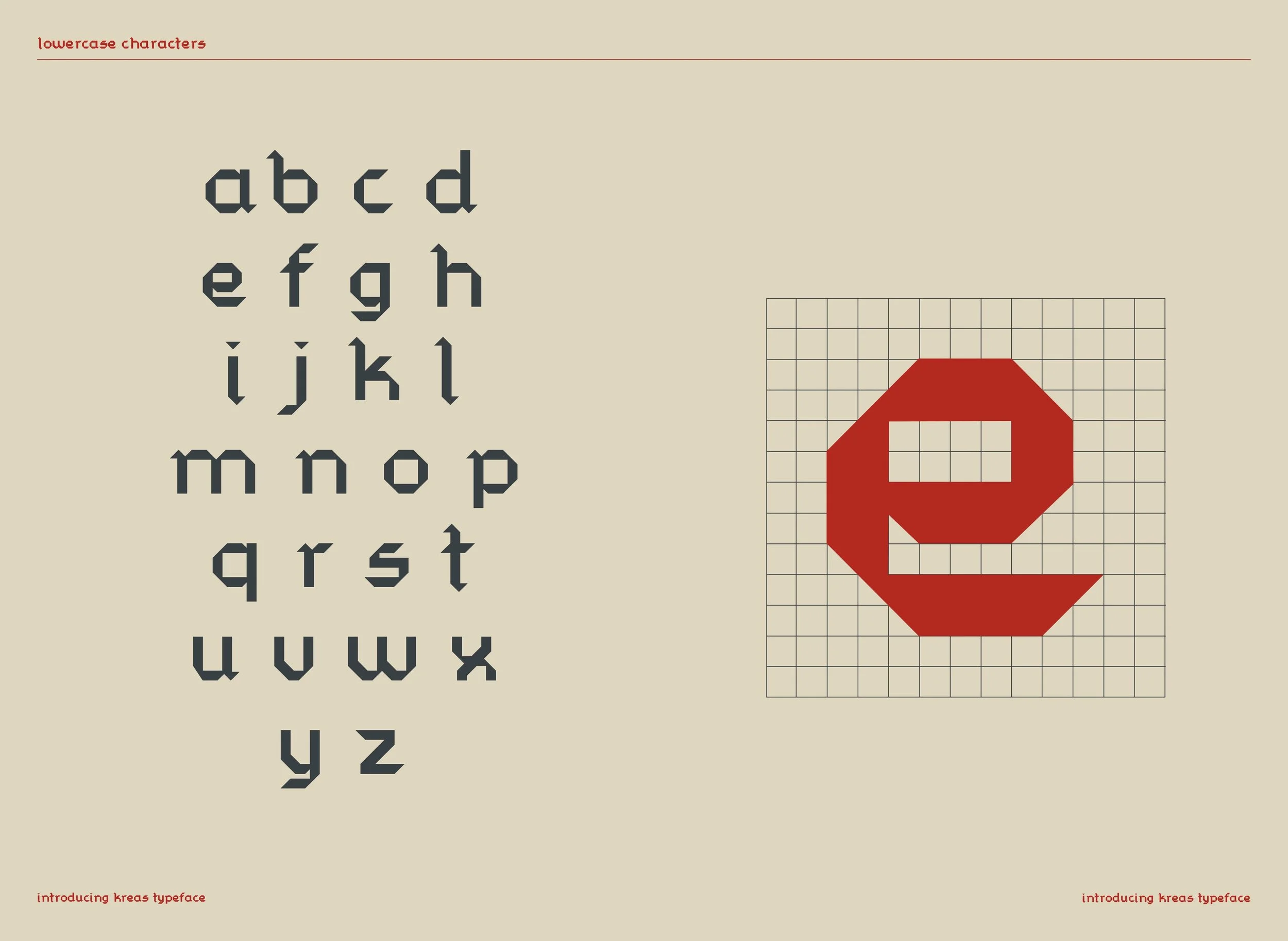
To discover the initial forms of each letter, I draped ribbon deliberately to look like each letter of the alphabet. From there, I would trace their outlines with a pencil on bullet journal paper and scan them digitally. The grid of the journal served as a basis to create a standard 9x9 grid in Illustrator to build each letter in. To ensure readability, I modified the angles or counterforms of the original scans and overall made sure that the letters felt cohesive as a family.
